Pantone vs CMYK
What is Pantone vs CMYK? They are the types of ink mixtures used in printing. Let’s start with the very basic descriptor of each.
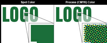
- Pantone is a spot colour premixed by the ink companies to create consistency. There are no other colours mixed in it to create a solid colour that is the exact same every time.
- CMYK is a mix of the colour’s Cyan, Magenta, Yellow and black. By mixing different quantities of each of these colours, you create all of the different colours that can be seen in an image. If you use a loupe (a magnifying glass) you can actually see little dots with each of these colours creating the appearance of a solid colour or image.
Pantone
As said above, Pantone is a single colour. Each Pantone colour has a number attached to it to identify what it is. There are over 1,000 colours in the Pantone Colour Matching System. Each colour can be followed by a code, for example “U” stands for uncoated stock. The “U” refers to the type of paper the colour is printed on. Each colour will appear slightly different on different types of stocks, based on how the paper absorbs the ink.
Why do we use Pantone instead of CMYK.
- Consistency
- Ease of communication between graphic artist and manufacturer
- On a printed item that only has one colour, to save money.
When using the Pantone system, whether printing on a piece of paper, silk screening on a clothing item, or using embroidery, it tells the manufacturer exactly what the colour should be in your logo to create consistency among all marketing materials. When printing in Pantone, you usually wouldn’t use more than 3 spot colours on a job. That is when CMYK becomes more cost effective.
CMYK
Why do we use CMYK? Well, when using Pantone, you only have one solid colour. How do you create an image like a picture of your office building, or yourself? That’s why we use CMYK. The Cyan, Magenta, Yellow and Black gets mixed together in different variations throughout an entire image to create what the eye see’s. If there are more than 3 colours, or a picture on a printed piece of material, it makes more sense, and becomes more cost effective to print in CMYK.
Can My Logo be Created in Both Pantone and CMYK
There are companies who do this. They have a logo created in both CMYK and Pantone so that when printing they have an option as to how they want to print it. When looking at a CMYK vs Pantone colour bridge book, it will often tell you, what the matching Pantone code is for the corresponding CMYK values. However, not every CMYK colour has a matching Pantone code. When creating a logo, if you don’t pick a CMYK with a corresponding code, you may have to find the Pantone code that is closest.
You know what’s cool? There are some companies in the world that want their colour to be completely different, and have their own Pantone code created for just them.
Can you guess which major companies have created their own Pantone code?